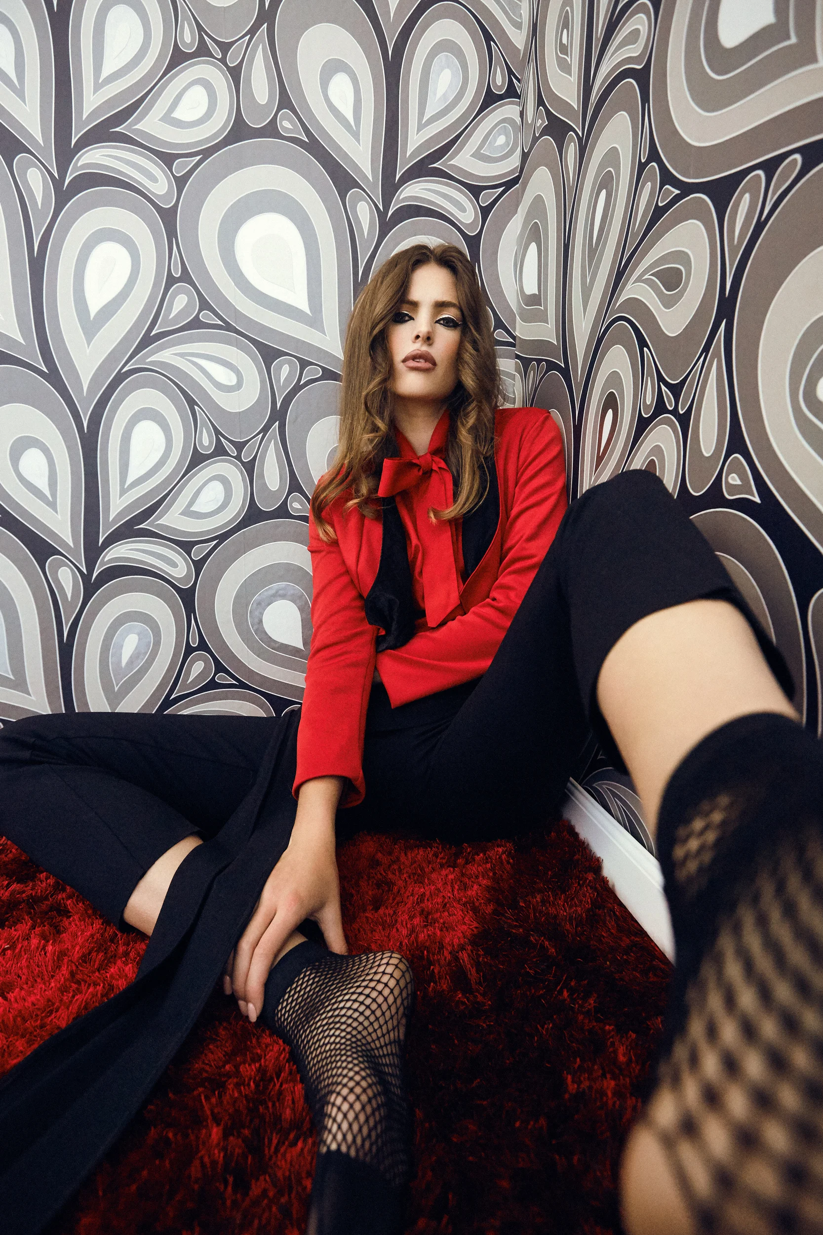
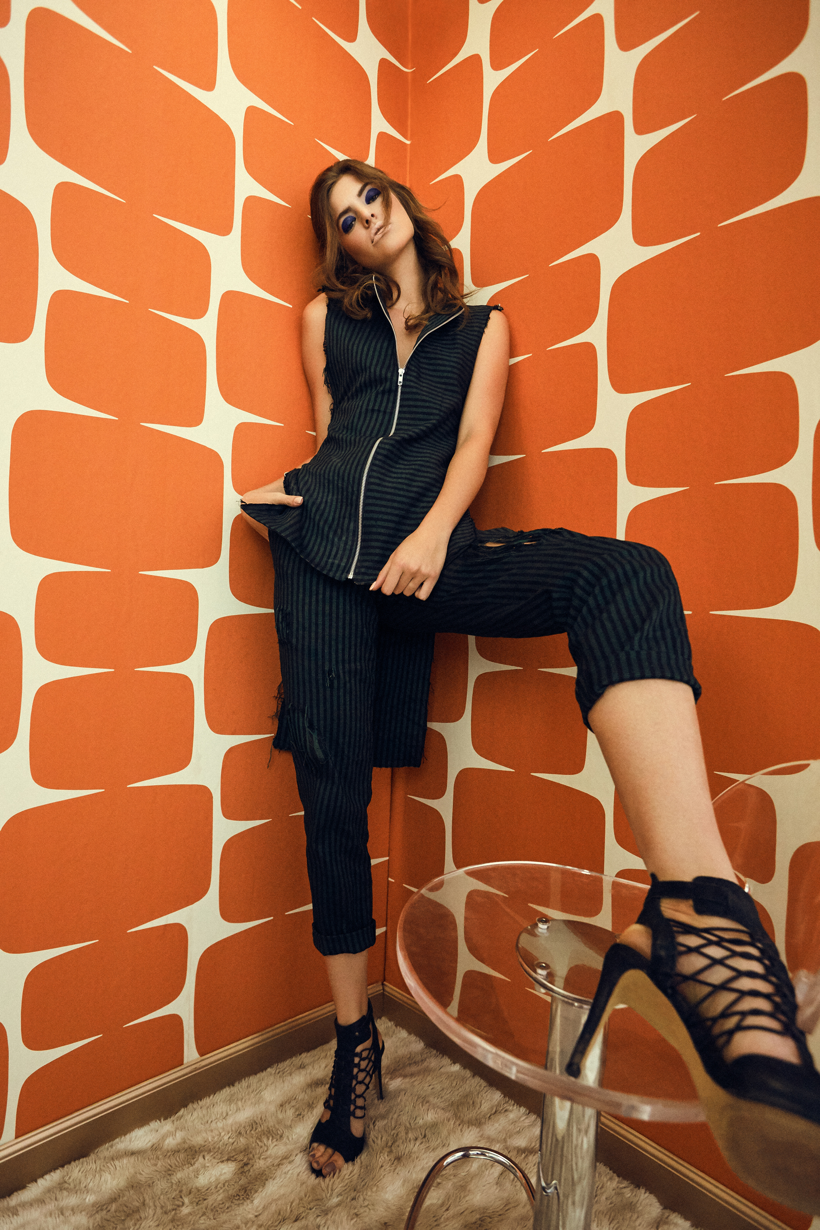
PATTERN
I would say I'm most known for my fashion photography, especially with the virality of the fashion editorial I photographed in Havana, Cuba.
While I love fashion, I love people more. The past several years of grinding in the industry has left me somewhat uninspired to capture fashion and more inclined to photograph inspiring humanity. I've been fortunate enough to gain clientele all over the world which has left little time for pure conceptual creativity. I started my business on the foundation of my own concepts, lighting and styling. The creative projects I produced eventually led to my first print publication assignment and everything seemed to just snowball into what I called my job today. Throughout my time as a mentor and educator I’ve always preached: creativity leads to clients.
In 2013, I caught wind of a non-profit publication entitled "Pattern" based out of Indianapolis, Indiana which promoted the arts community and creativity through fashion. The magazine is a luxurious, over-sized, meticulously curated, award-winning biannual fashion, art and culture publication. The level of talent required to be published in this magazine has always been met with a high bar. I wasn't ready, but I always kept the magazine in the back of my mind.
Fast forward to 2017, I was asked to join the Pattern community in an intimate fireside chat to talk about the status of the photography industry, which I gladly agreed to. The event was a sold out success. Upon my return to the "grind" I was asked to create a conceptual fashion editorial for their next Pattern issue. I was ecstatic, but time was not on my side. My travel schedule was to keep me away from my studio and left only one small window of time. I blocked out the days and immediately contacted my friend and designer Gunnar Deatherage on the possibility of a creative collaboration during that time frame. Luckily, Gunnar was available and the project was green-lit for Pattern magazine.
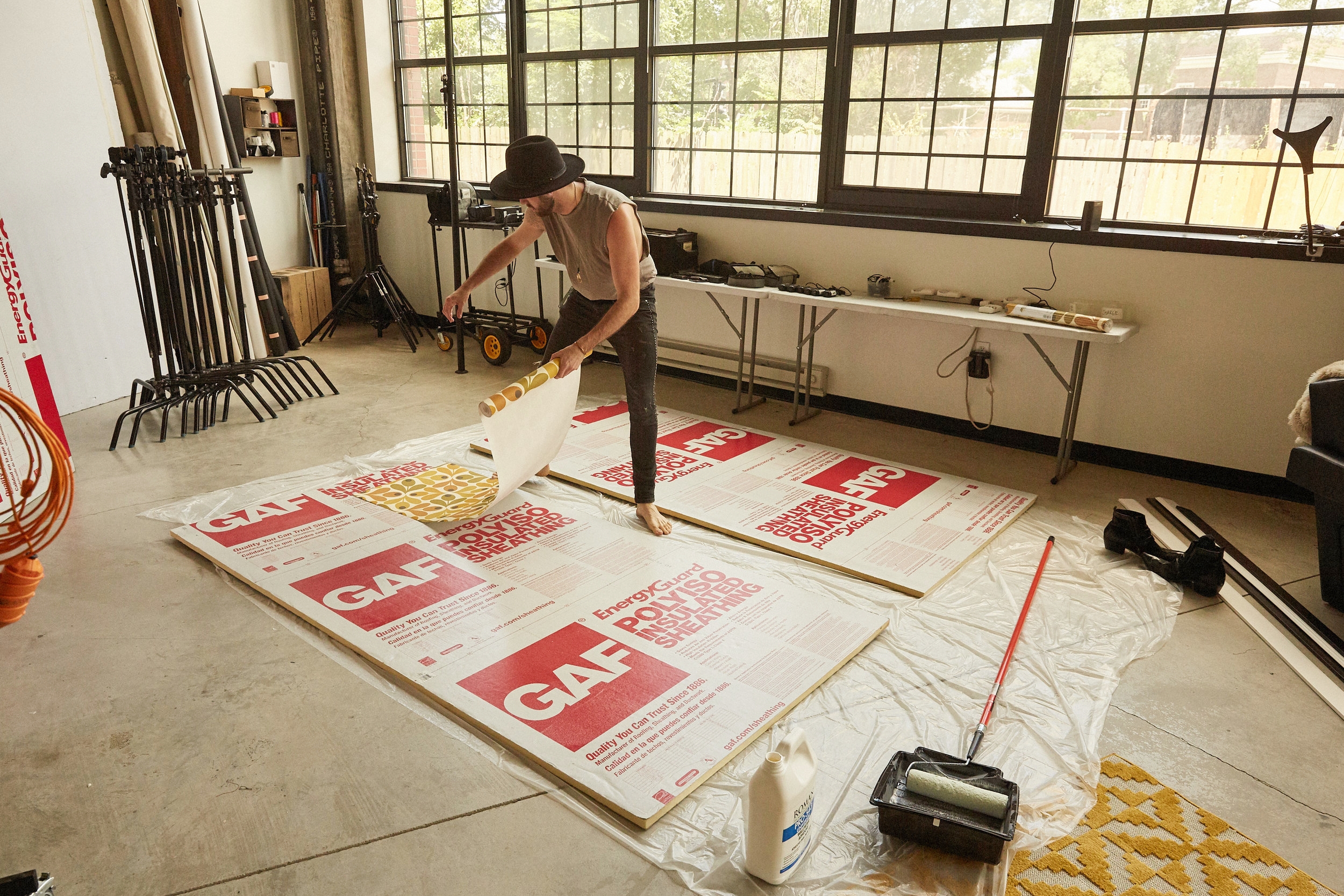
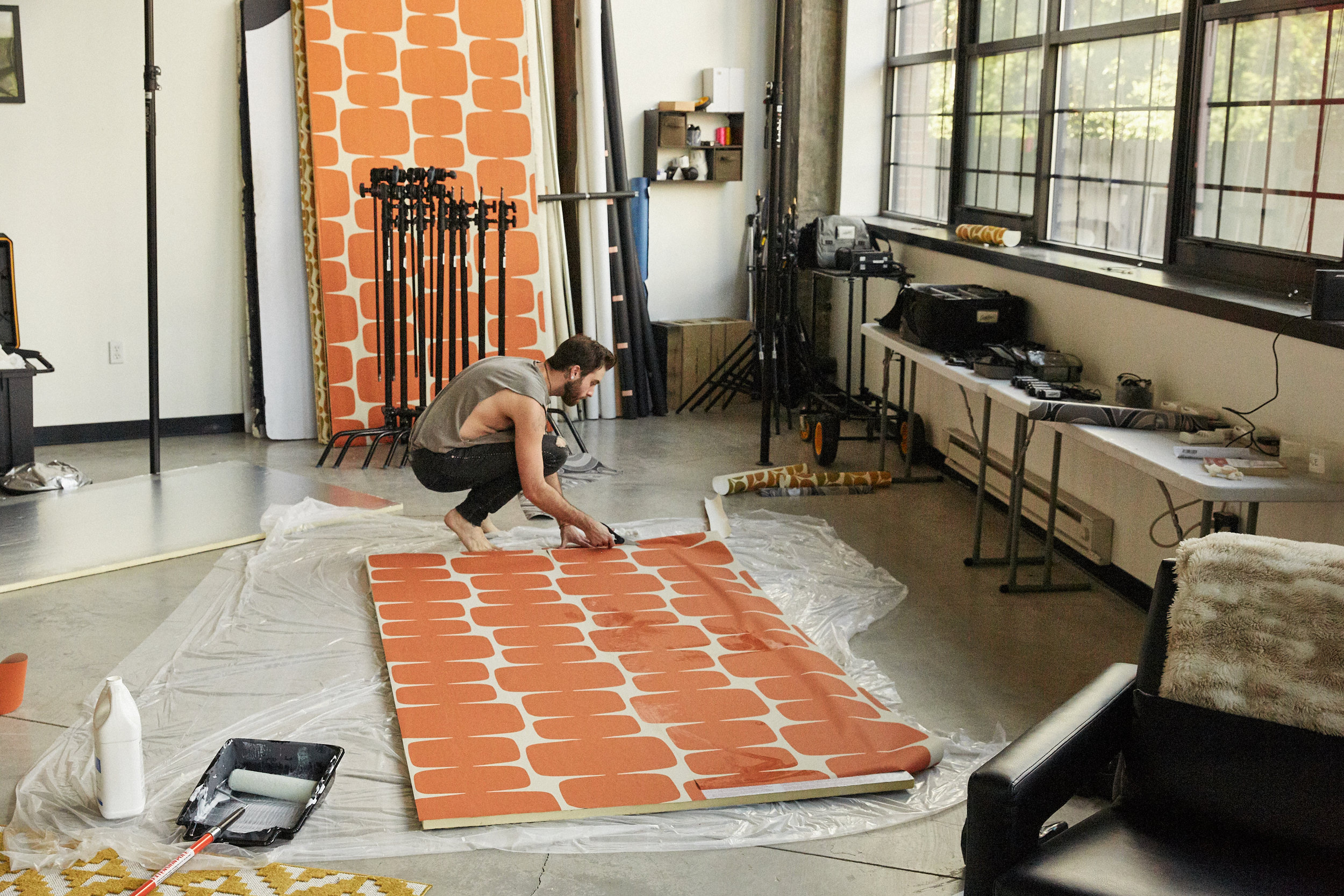
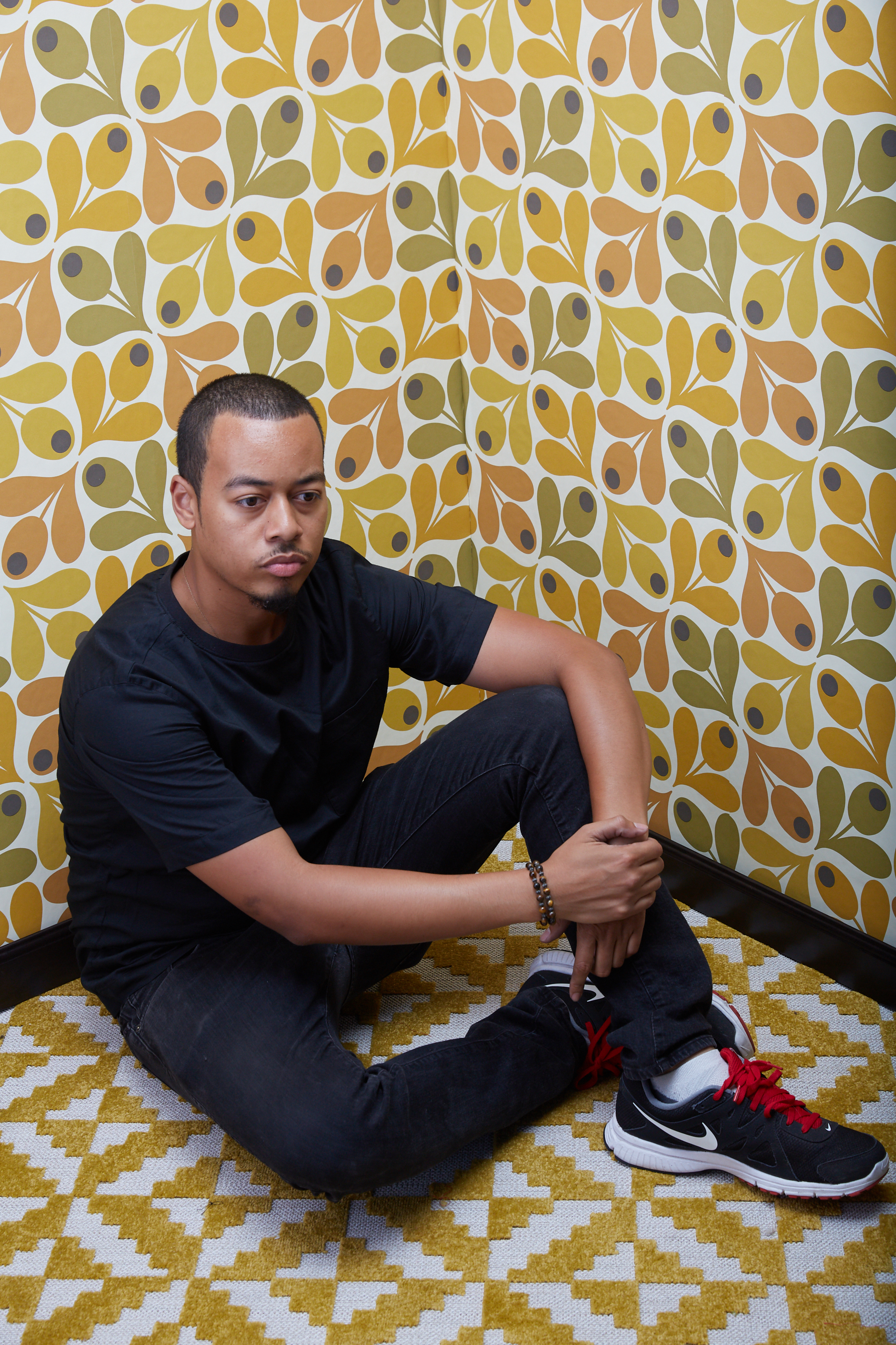
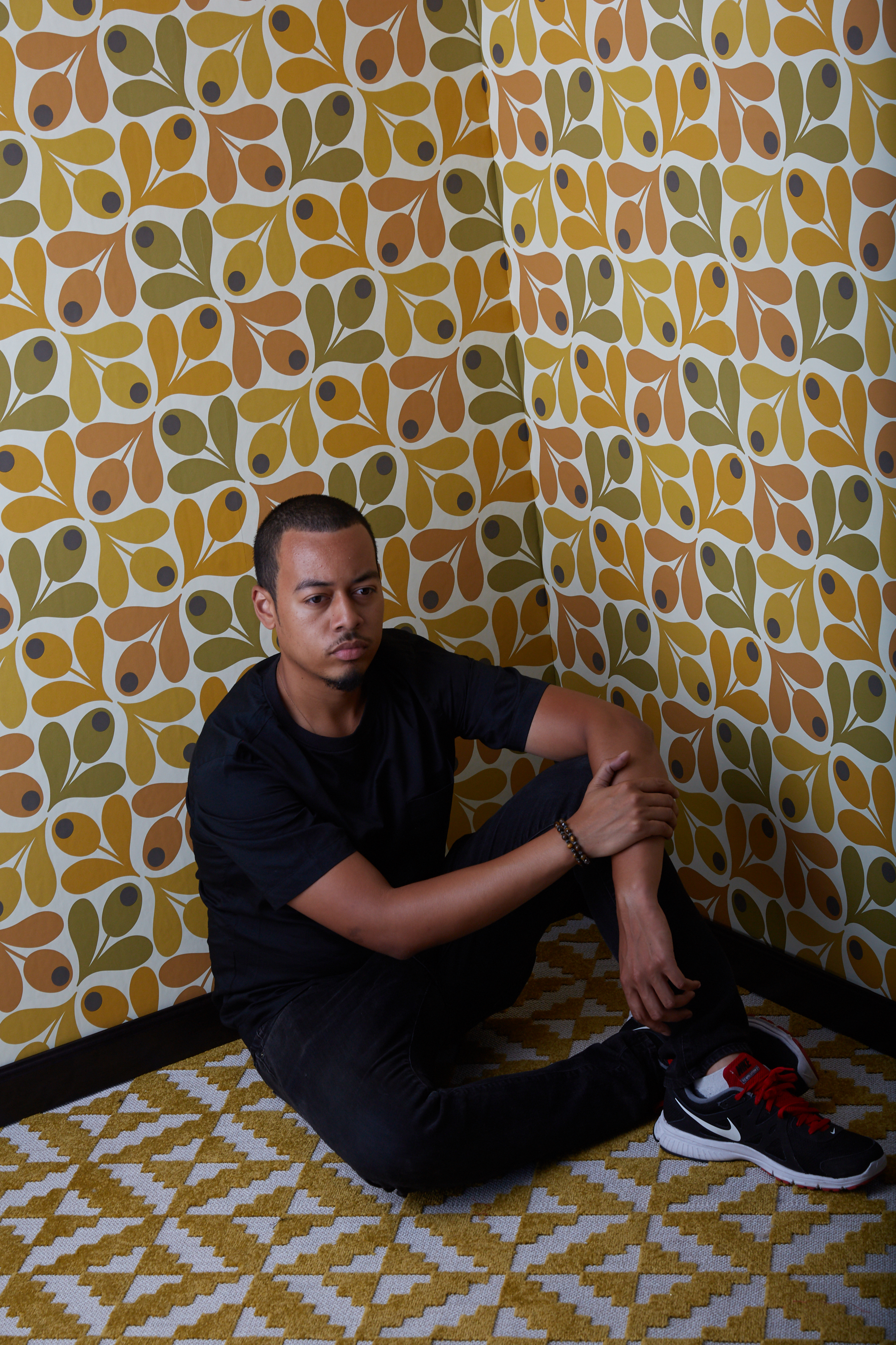
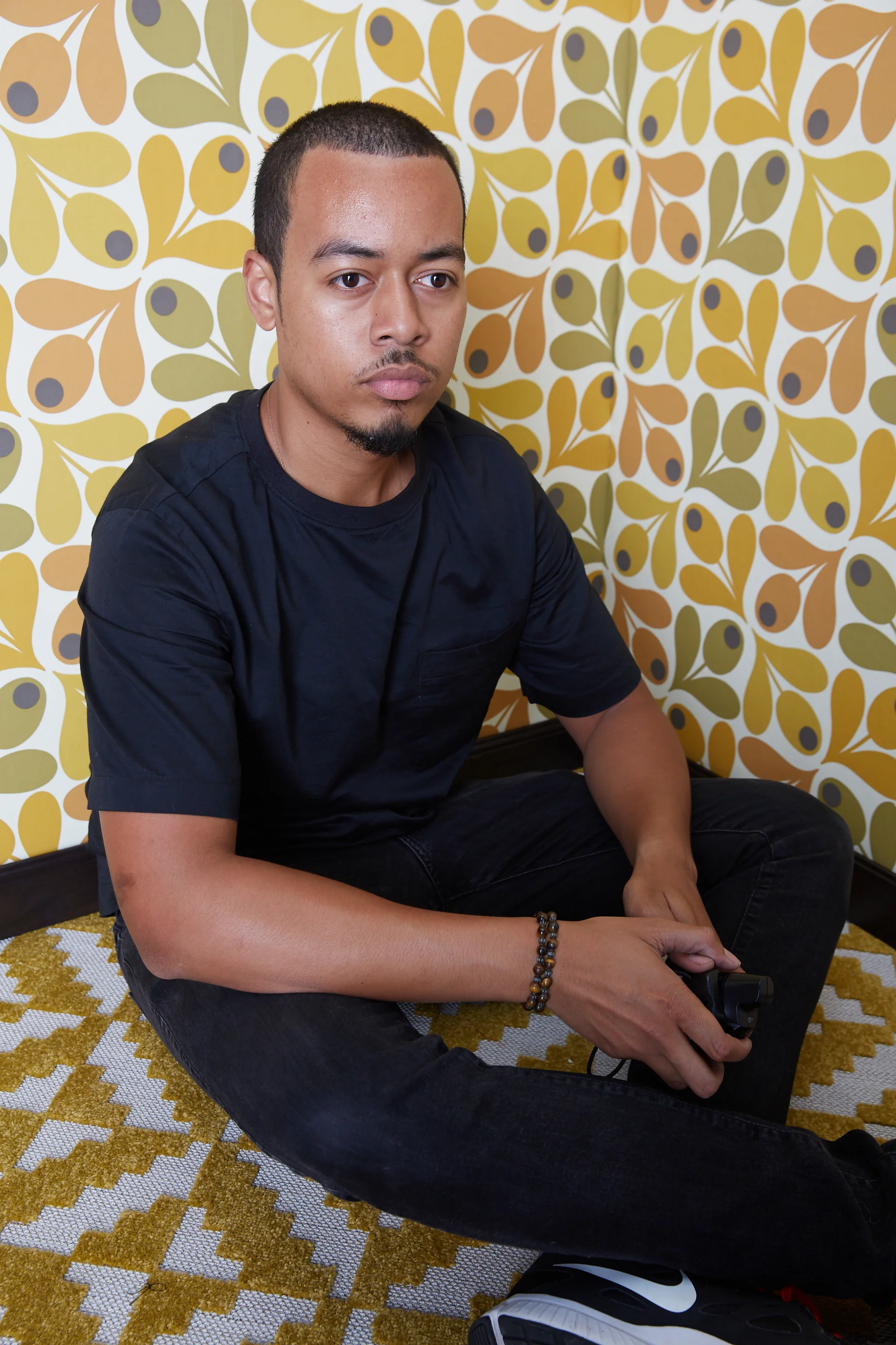
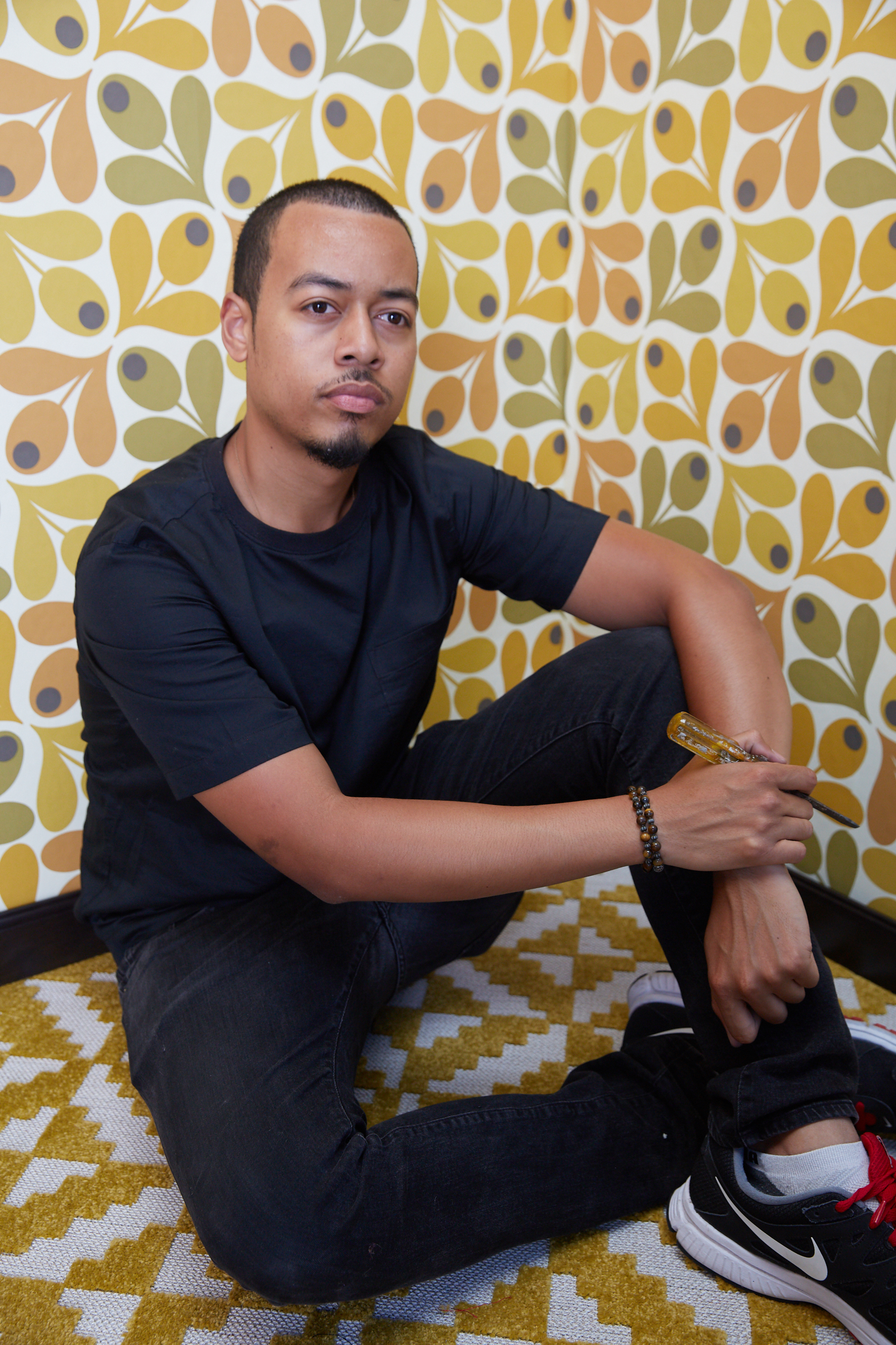
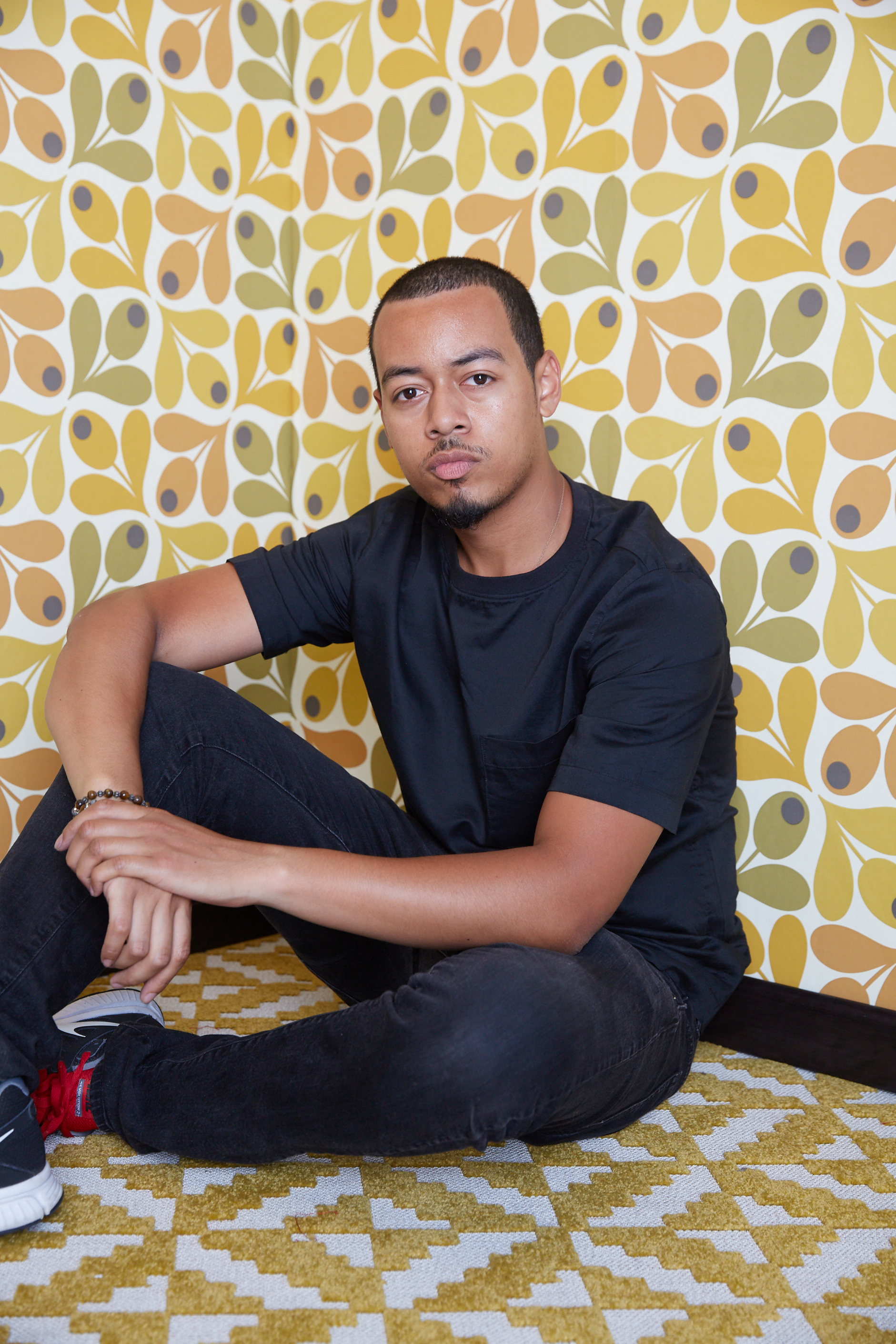
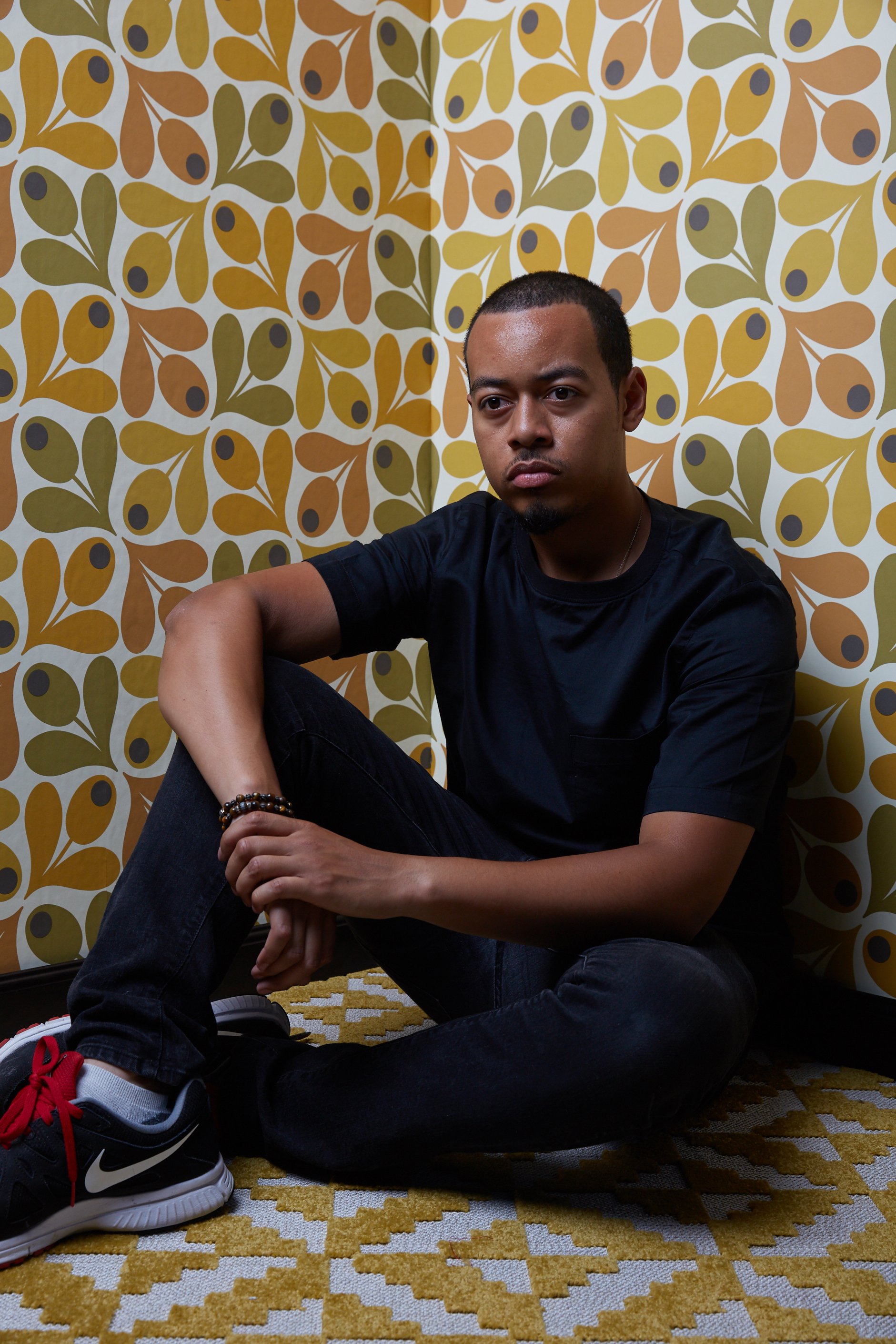
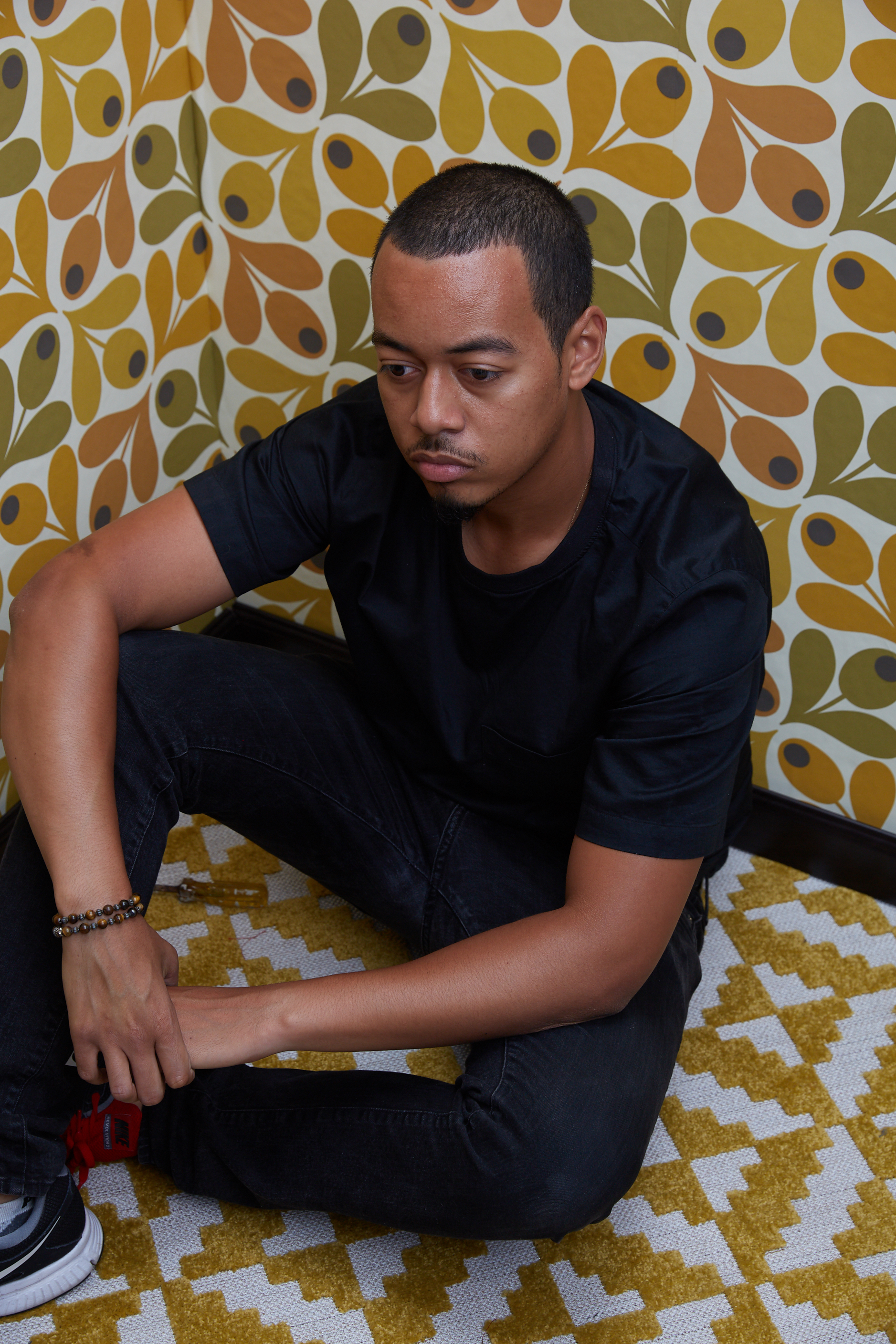
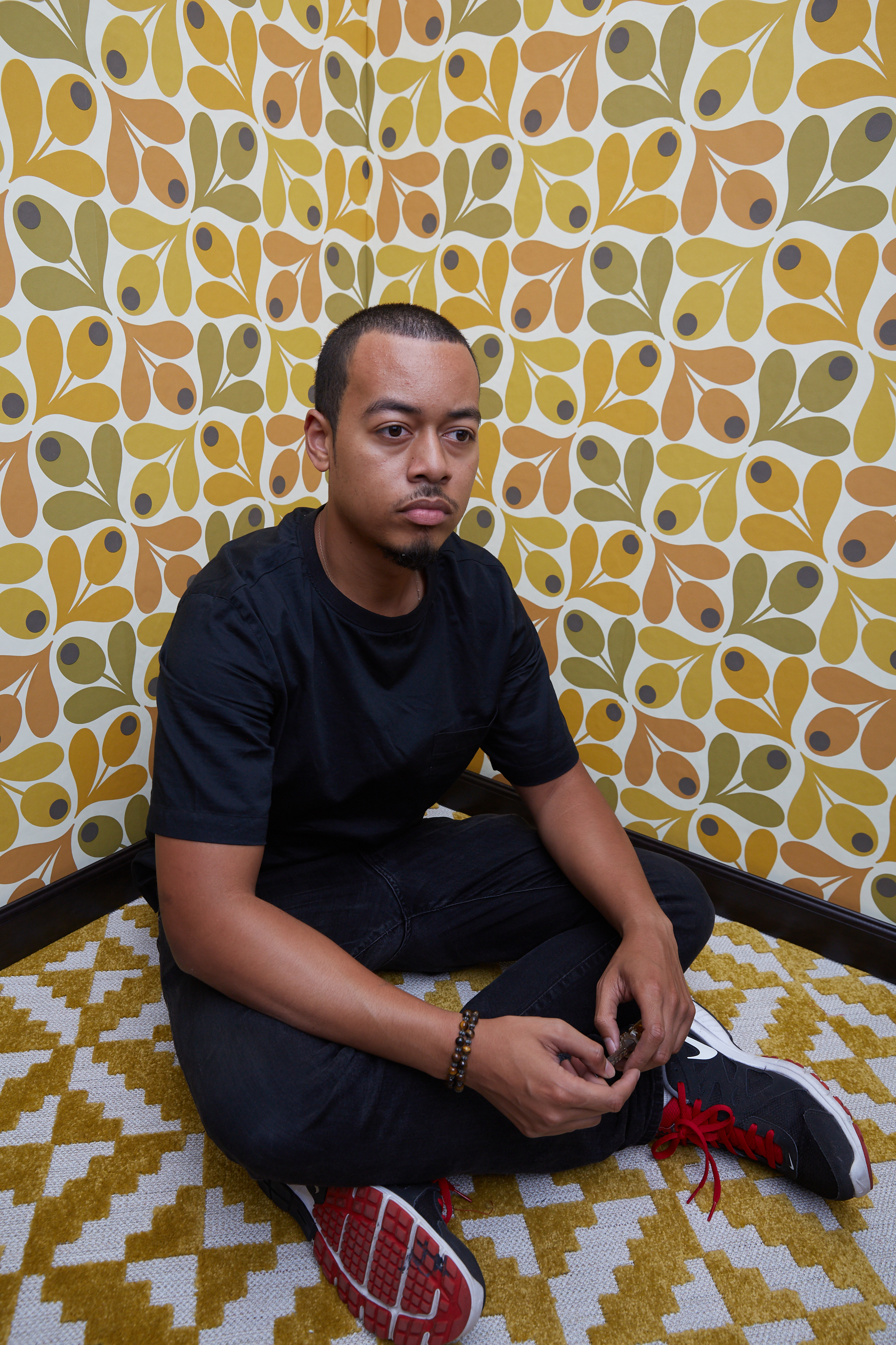
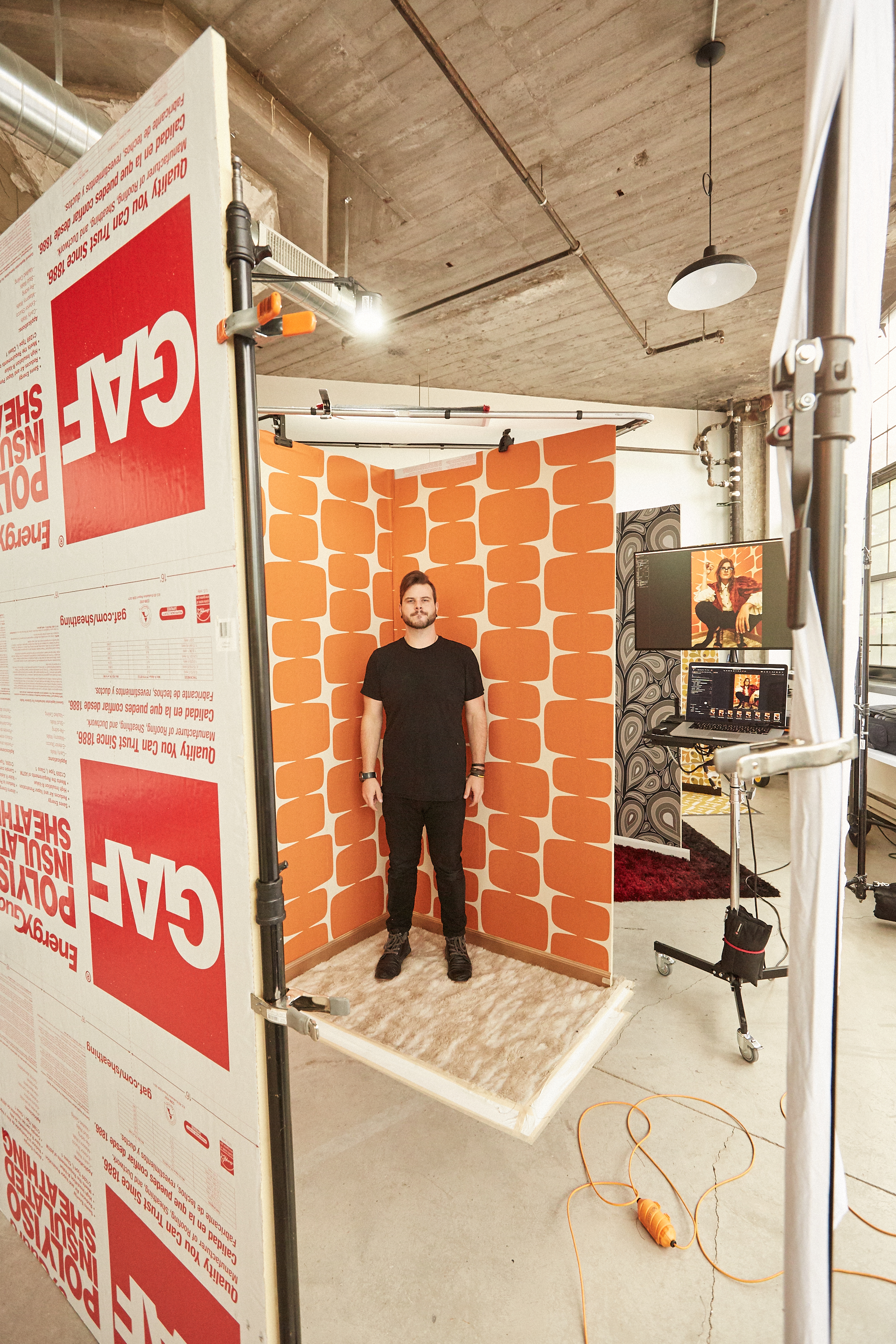
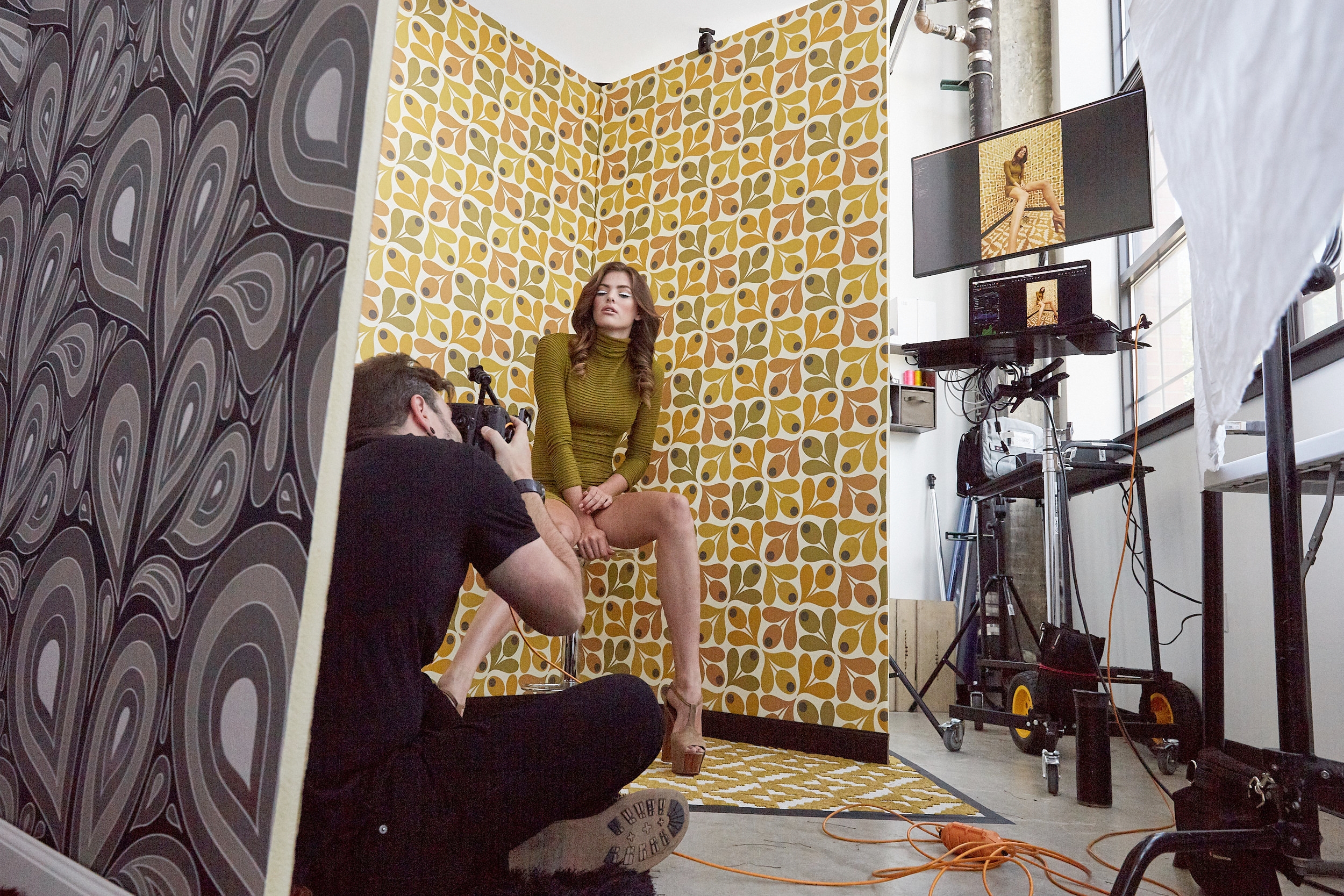
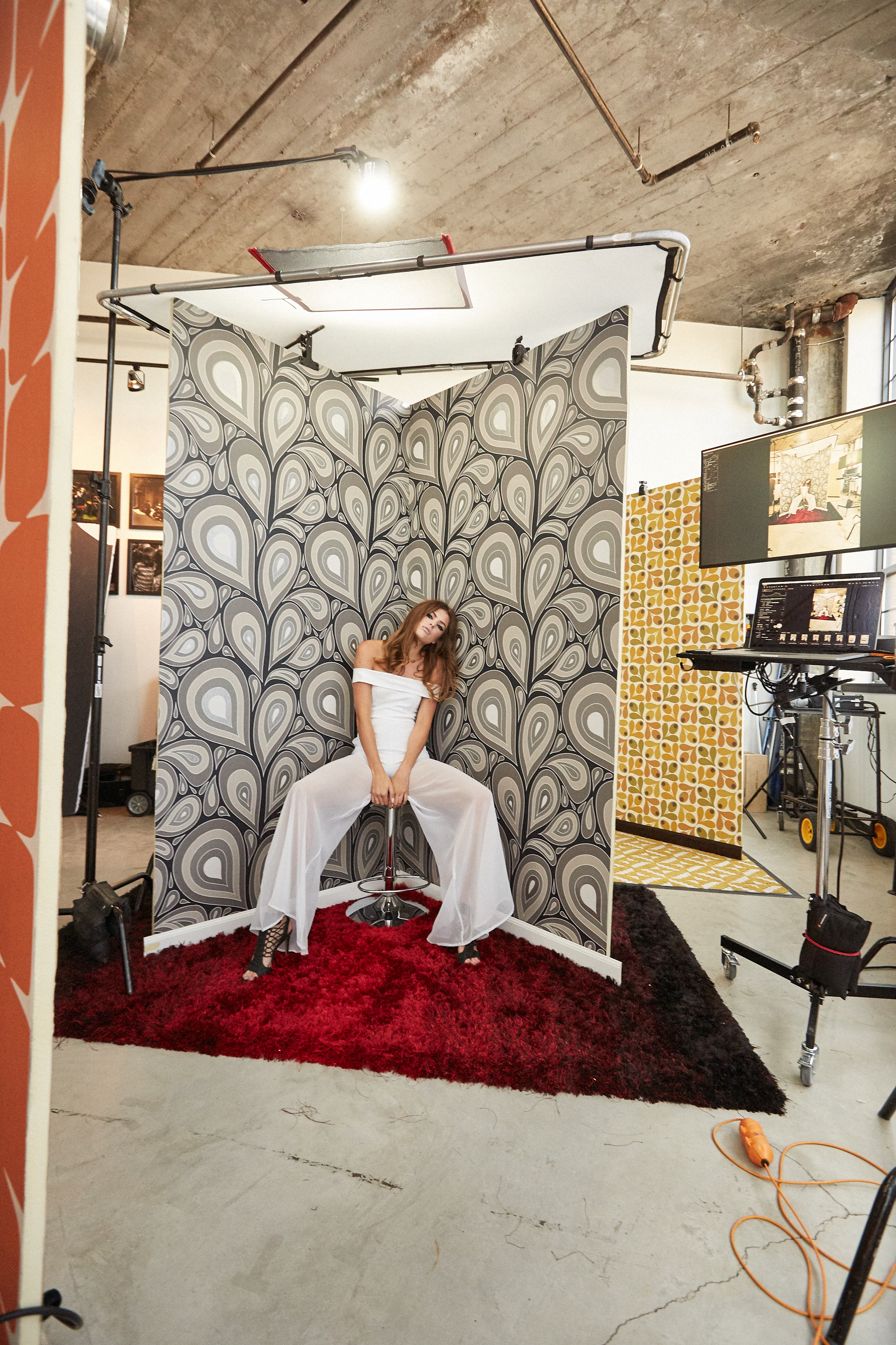
The initial idea was to go above and beyond any creative project I had produced in the past. While we wanted to remain in the studio, we wanted to build a series of elaborate sets that resembled the corner of three individual rooms from a specific time period. Gunnar and I took an afternoon to explore the city of Louisville, Kentucky for wallpaper and flooring influenced from the fly and fashionable 1970s. While we purchased all the needed supplies, including six 4x8’ sheets of polyboard, wallpaper glue, paint tools and tape we just couldn’t find the right wallpaper or flooring to construct each set.
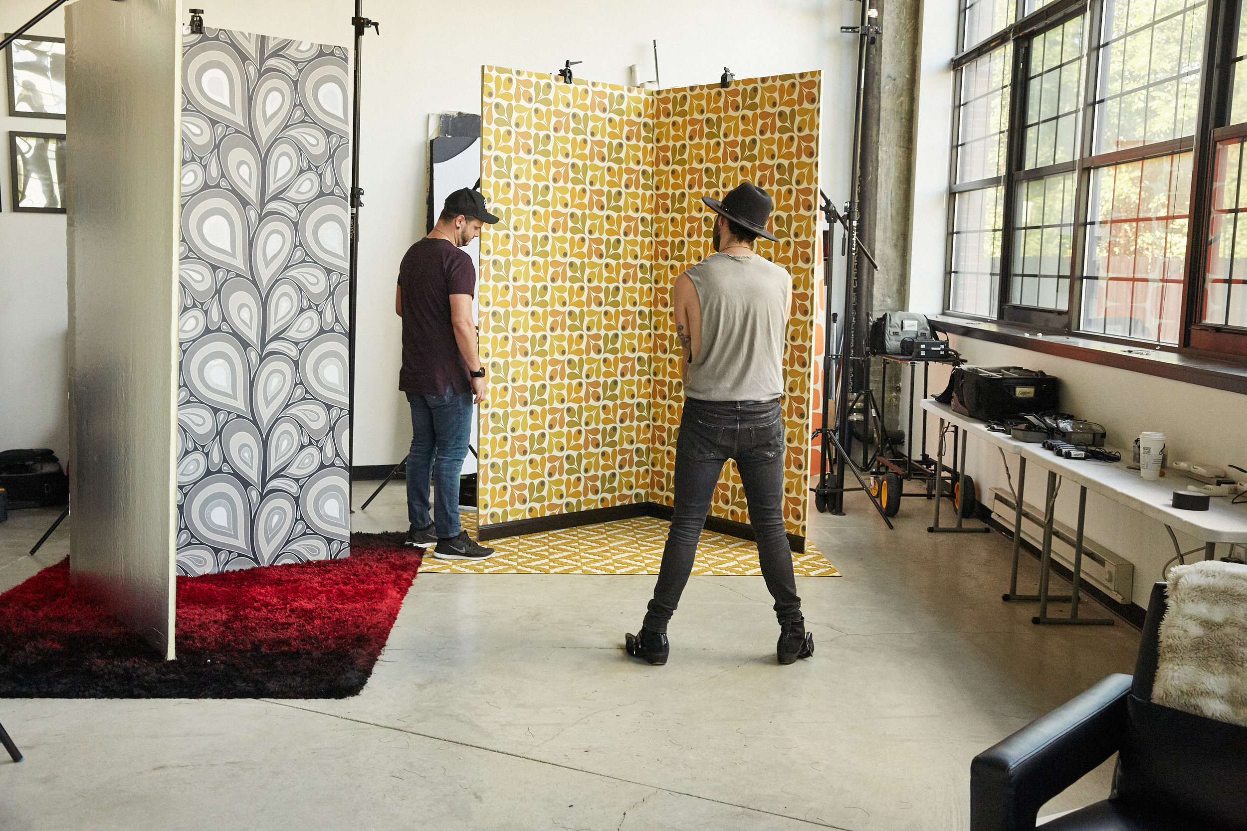
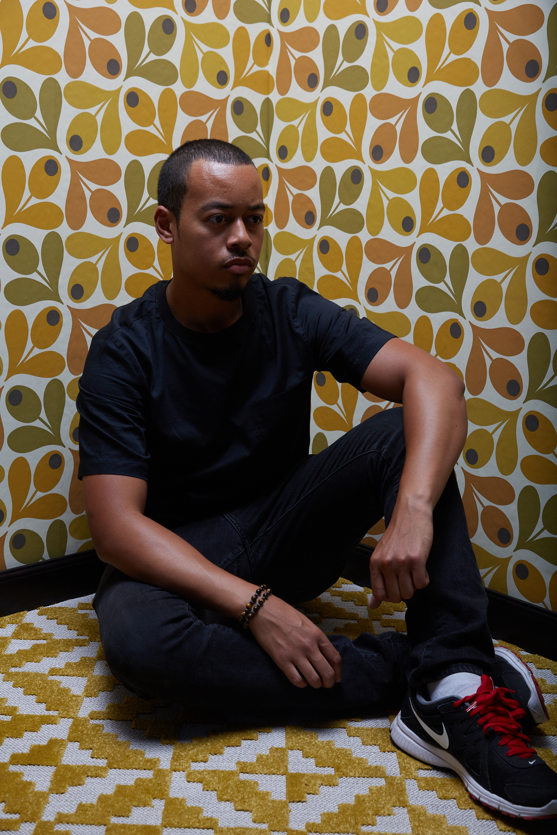
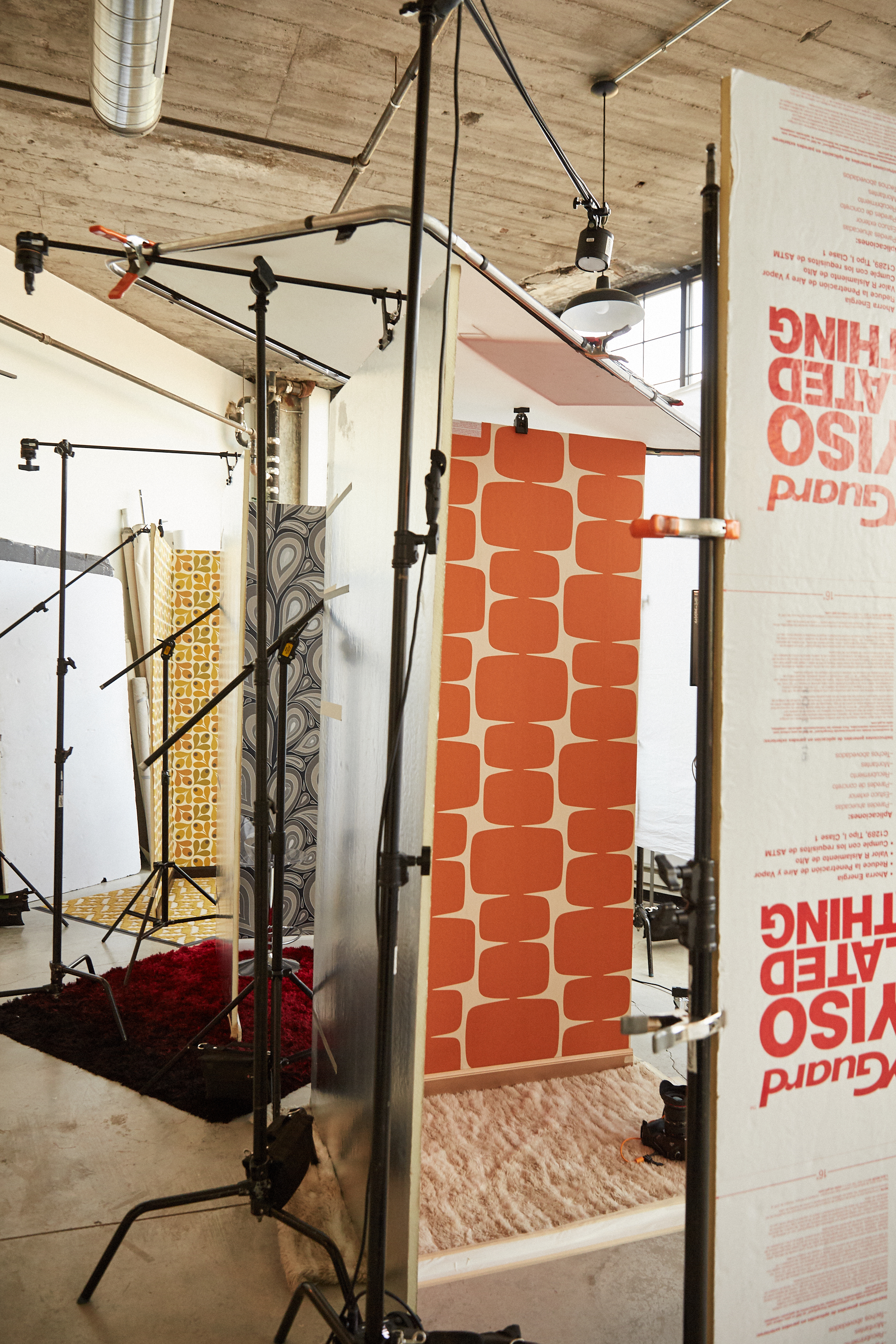
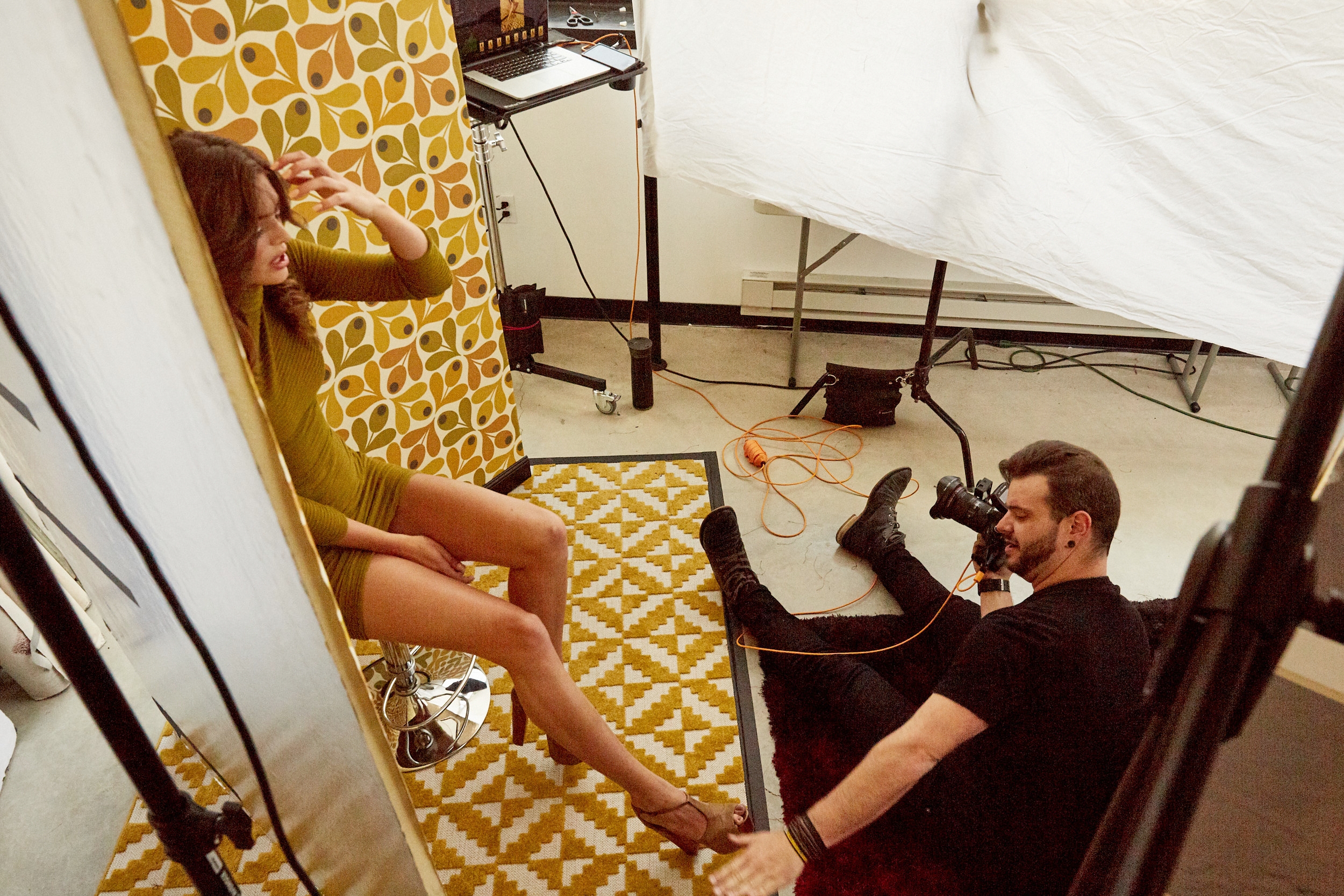
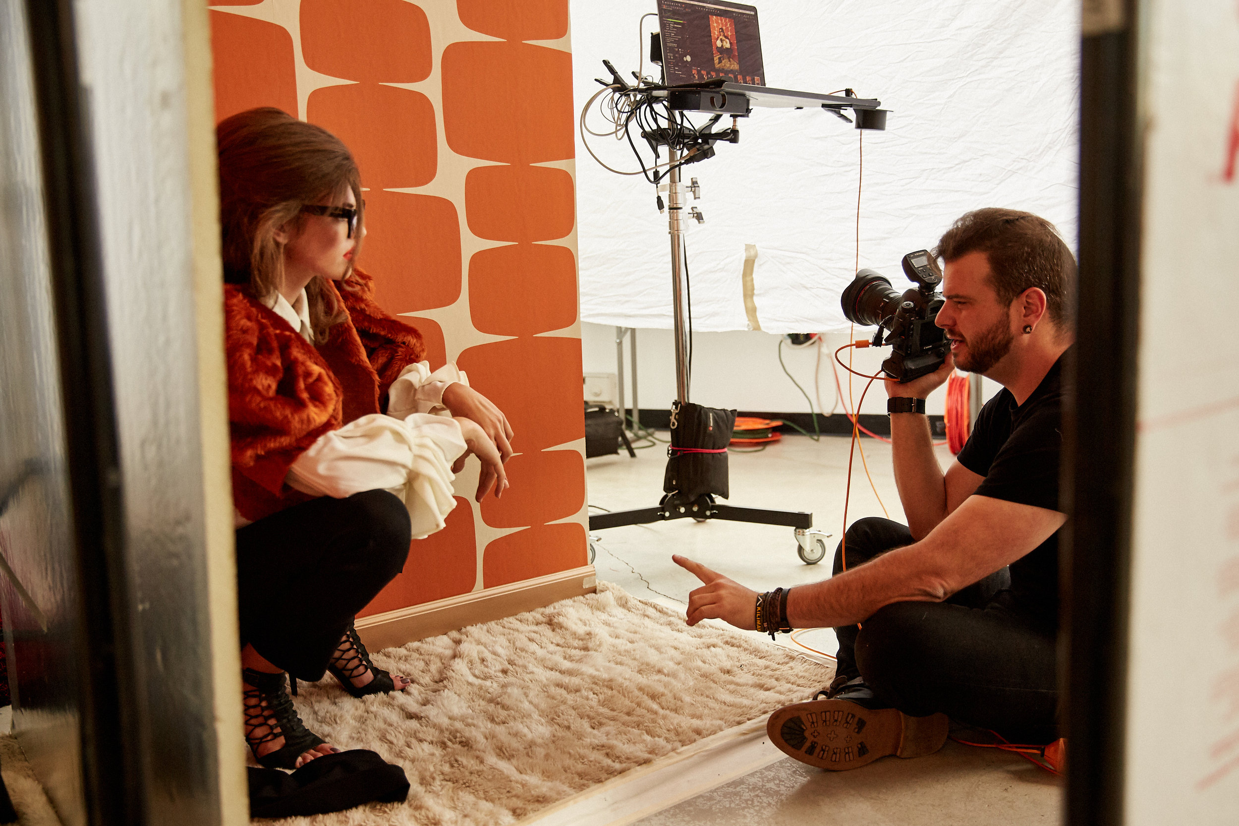
I trusted Gunnar to seek out the right materials and a few hours later he directed me to an online store “Wallpaper From The 70s.” Sounds legit, right? Shockingly, it was completely legit and was one of the better e-commerce sites I’ve navigated. Albeit an investment, we finally had our selection of "retro" wallpaper. We decided to improvise the flooring with various colorful rugs and even a plush blanket lying around my studio. We constructed three different “corners” with the intent to photograph two looks on each set. First, Gunnar properly applied the wallpaper to each 4x8’ sheet of polyboard to create the walls. We then taped the rugs to my studio floor and secured the two walls upright and together to form a “V” with two Manfrotto 420B Combi Boom Stands and two Manfrotto Super Clamps. Each corner was lined with different colors of wall base molding to give the illusion of a real room. We secured any weak point with gaffer tape. I was thrilled with the overall look and very confident, but the fun had just started. After hours of hard labor we began to pre-light and pre-stage. I quickly realized after setting up a few lights that it would be a very long afternoon.
I suppose I have grown tired of the same perfect composition, the same background and the same dramatic lighting. I wanted something that felt raw, intense and intimate. I wanted to explore a new style of camera composition and lighting like never before. Lighting is a science to some, but it’s more of an expression to me. While I had an overall vision of what I wanted the final photograph to resemble, I had trouble translating that vision to real-life circumstances. We went from light setup to light setup and nothing was working, I began to feel frustrated and overworked. Fortunately, I have enough experience in photography to realize when I begin to feel defeated; strip every light away and start with the basics… natural light. It was the best decision I could have possibly made. Although the color was off, the light pouring through my large studio windows was gorgeous.
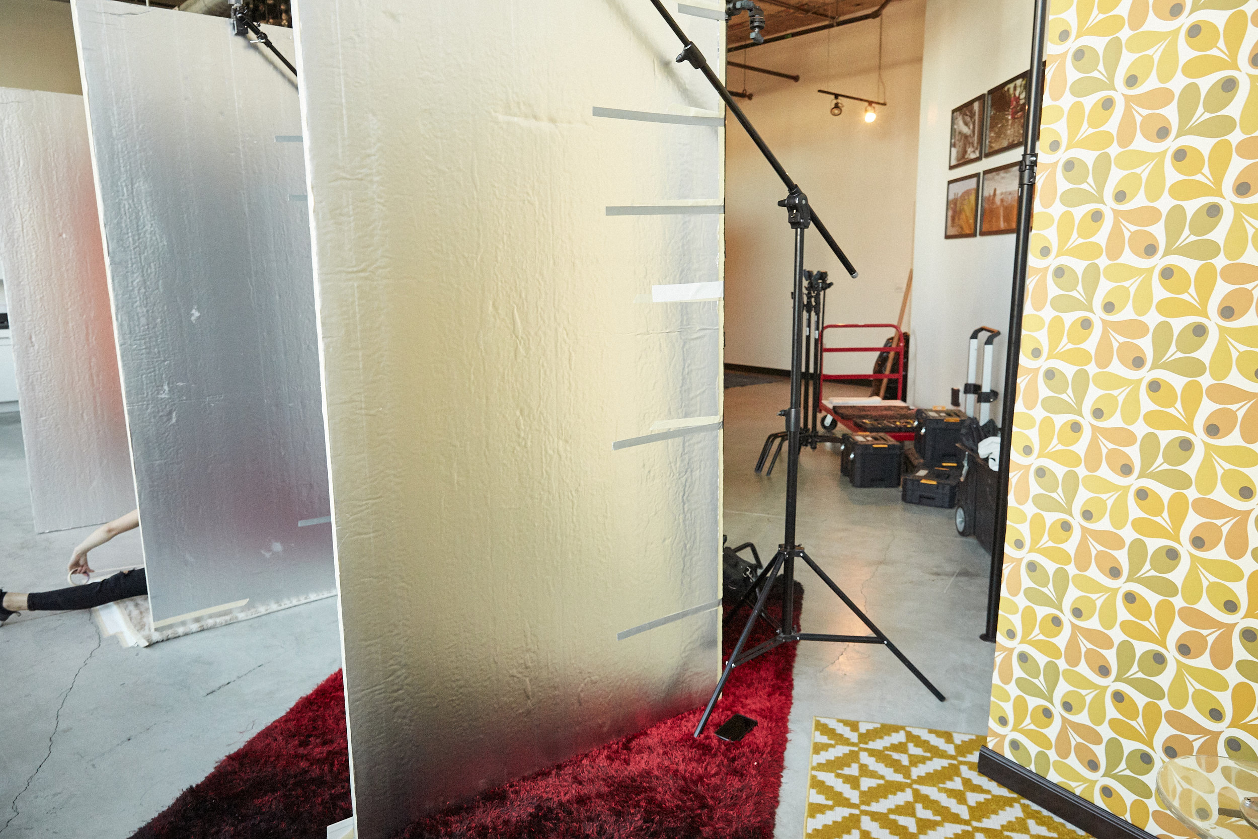
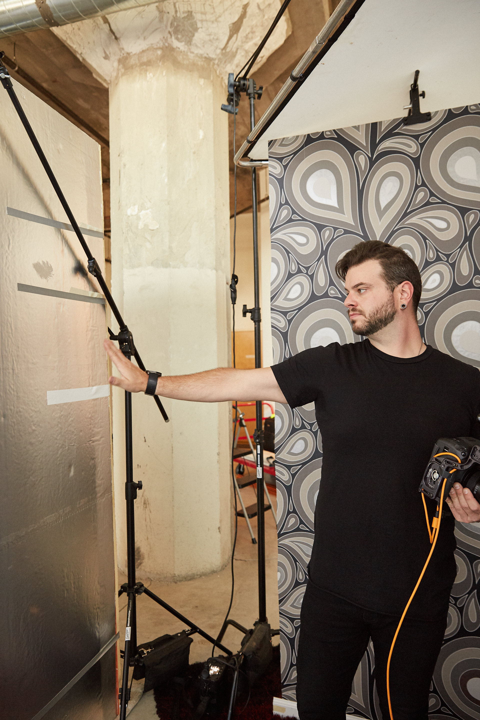
We had to completely rebuild each set, so each corner was perfectly parallel with the studio windows. We placed each corner in one row, measuring the distance from one set to another for consistency. Coincidentally, the back of each polyboard was made with a silver reflective material and was the perfect specular fill. Our last obstacle was creating a natural overhead light that resembled the lighting from a flush-mount or a recessed light to fill the background. We placed a 3x6’ Lastolite Skylight Rapid Kit over the set and rigged a Profoto B2 Kit about 2 feet above the white diffusion panel. The B2 Kit was set to its lowest setting: 2.0 at 250 watts seconds. In order to reduce the power of the light further, we clamped a Matthews Open End 18x24" Black Scrim to the edge of the diffusion panel. The light not only lit the background, but it also provided a subtle hair light, which blended well with the natural light. In order to block harsh sunlight and guarantee the light on each set would appear similar we rigged a 12x20' 1-stop fabric over the windows parallel to each polyboard. After dozens of light tests, we finally had light that would be solid enough to move into the actual project the following day.
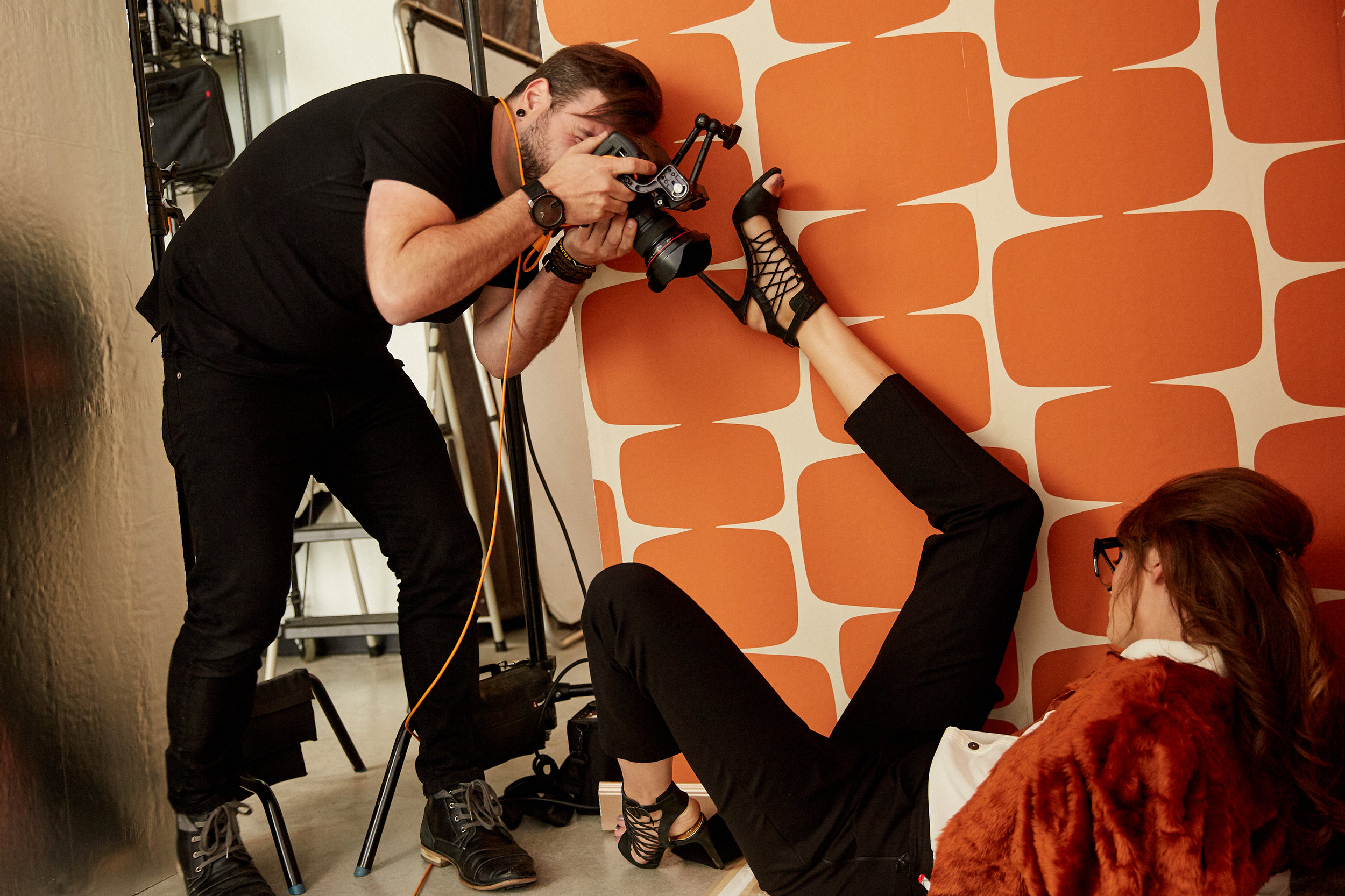
I initially thought about using the standard Canon 24-70mm f/2.8L lens, but instead opted to use a Canon 16-35mm f/2.8L lens for its ultra-wide angle perspective, which I planned to use to my advantage. I wanted hands and feet distorted. I wanted it to be “in your face” and I wanted it to feel as unprocessed as possible. While hair and makeup began, I began to lock in my camera settings and plan composition. I ultimately decided to introduce a clear plastic adjustable chair, a prop that could be used to provide some element of interaction for the model. When our model Sofie Rovenstine stepped onto set I felt a rush of confidence and connection. I felt all over the place, my camera never stopped moving and I didn’t stop firing the shutter, it felt abnormal and completely energizing. Throughout the day, we attempted several unique compositions which used lens distortion to create interesting leading lines in the body, such as her foot resting on the lens, my hand gripping the chair or her face leaning towards the camera. Fortunately, we didn’t have to alter the lighting once. Our plan to maintain consistency throughout every set worked and the transitions between looks were seamless and quick.
The final decision was tough. I poured over all the images for days, but finally landed on a set I believe we all can be proud of. Reflecting, I spent nearly a thousand dollars and sacrificed hours of time for this editorial, but this project left me refreshed and prepared for a new approach to my fashion work. While I respect what I’ve accomplished in the past, it’s very important, personally and professionally, to reach for the stars and climb to new heights. This project may not open new doors, but it will certainly add a rung in the ladder to defining the new version me. A journey I started a year ago.
If you’re interested in learning this exact technique step-by step, be sure to check out my brand new Fstoppers tutorial on "Fashion and Editorial Portrait Photography" which dives into the world of lighting, retouching and shooting for magazines. I've spent years building instinct and now I want to share it all to you; packed into 18 lessons, 12 hours of video content, and a lifetime private mentorship. Buy the tutorial, you won't regret it.
A special thanks to Gunnar Deatherage, Jordan Hartley, Isidro Valencia, Alexandra Hepfinger, Ashley Roberts, Sofie Rovenstine, Ginny Maxwell, AMAX Talent, Polina Osherov and the entire team at Pattern. As well as my sponsors for their love and support for this project, Profoto, Tether Tools and ViewSonic.


